
PROFESSIONAL SERVICES
Only Fiji
BRANDING · WEBSITE DESIGN · COPY · BUSINESS CARDS
We love blank canvases - the opportunity to create from scratch most or all of the communications to help launch a client’s business. So it was with Roann Robert’s project for her specialised travel business, Only Fiji. It was a bonus that Roann has so much marketing experience having been in the travel industry for 25 years and has a strong creative streak herself. While she had a clear image in her head of how she wanted to present her business, she sought a team to help her perfect and realise it. We’re so grateful she chose us.
Only Fiji is a boutique travel agency that specialises in offering personalised holidays to the Fiji Islands. Roann is passionate about Fiji, its warm-hearted people, its natural beauty and its varied offerings for New Zealand holidaymakers.
Michelle designed the logo and various iterations of it after long conversations with Roann. As usual Michelle used her tried and true process to uncover which styles, motifs and colour palettes resonated with her client. Imagery was sourced mostly by Roann whose contacts in the industry support her venture. She has also taken some of the photos herself as it’s important to her to show Fiji as her own clients might see and experience it.
The words were written by Diana in Roann’s voice. It was very much a collaborative effort and the content will evolve as the business does.


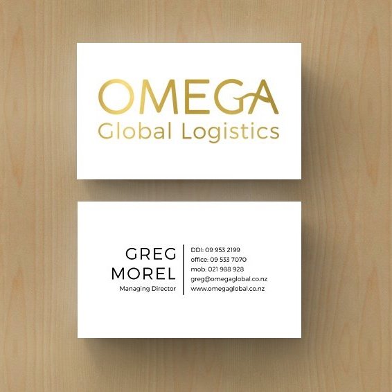
Omega Global Logistics
BRANDING · COLLABORATION ON WEBSITE DESIGN · COPY · BUSINESS CARDS · PHOTOGRAPHY STYLING
It was a word-of-mouth recommendation that led Omega Global Logistics (OGL) to approach Michelle to completely redesign their branding. Their previous logo had become dated and no longer reflected their company or the range of services they offer today.
Michelle felt honoured to have the opportunity to create a whole new look for a company that has been in operation for over thirty years. Director Greg Morel and the team at OGL were involved at all stages of the rebrand and involved it was!
As always, Michelle started by creating sketches to get ideas flowing and sought feedback on their preferences for logo style, colour palette and font. Initially, she worked with design motifs from shipping and other forms of transportation. However, after much deliberation, it was decided that something simpler conveying the company’s emphasis on the quality of their service would work best. We all settled on an elegant typography logo in gold which was given extra ‘zhoosh’ on their business cards through the use of a foil.
Michelle collaborated on the design of the website and helped style and direct the photography shoot.
Diana wrote the words, working closely with Greg and other team members. Due to COVID restrictions, all exchanges were via Zoom or phone - we never met in person. For us, this was not particularly unusual as we have clients in various parts of the world, all of whom we’ve never met 'in real life’.


Edison Tam Lawyers
WEBSITE · BRANDING · BUSINESS CARDS · COPY · SOCIAL MEDIA · PHOTOGRAPHY
A recent project’s branding is inspired by chess pieces as both our clients enjoy sparring on the chessboard when their schedules permit. They see some similarities between chess and the strategic manoeuvres they make when applying the law to resolve disputes for their clients.
As always, we’ve crafted the website and the copy so that they complement each other. We also managed the photoshoot. All three elements work together to communicate Edison Tam Lawyer’s offerings and to reflect the firm's character and approach.
Thank you to Mike Edison and Jack Tam for choosing us to help promote their specialist law practice in South Auckland.


Pacific Wealth Creators
WEBSITE · copy · PHOTOGRAPHY
We nearly always have to work within certain constraints when we design websites for our clients. It’s a challenge we welcome. They may already have a logo they want to use or business cards or print resources they’d like to emulate. In this case, Pacific Wealth Creators had a logo and had produced a 16-page full-colour book to send to prospective clients. Our brief was to create a website that reflected the visual look of the book and borrowed from the copy.
As James Clague, the firm’s founder, is based in the Bay of Plenty he was enthusiastic when we suggested we could include some photographs of the region on the website. Diana shot all the photos of Mt Maunganui as well as that of Lake Wakatipu used in the main banner.
As far as the design went, Michelle adapted the book’s visual style to suit the web and followed James Clague's brief that it should follow Scandinavian principles - be simple, functional and inviting.

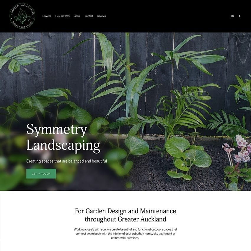
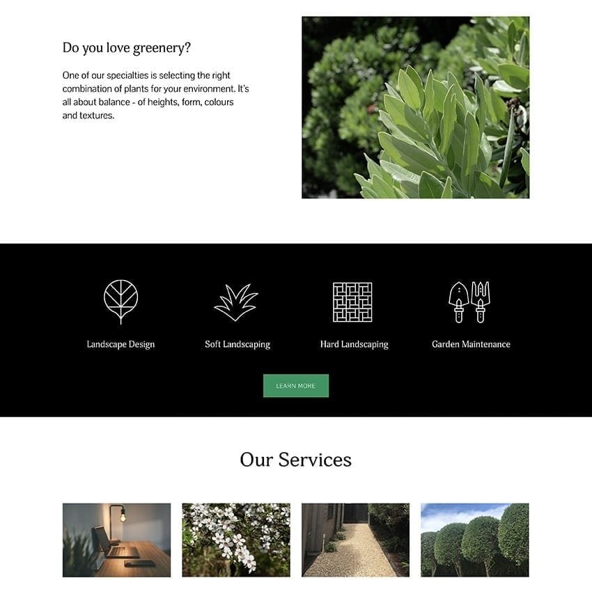
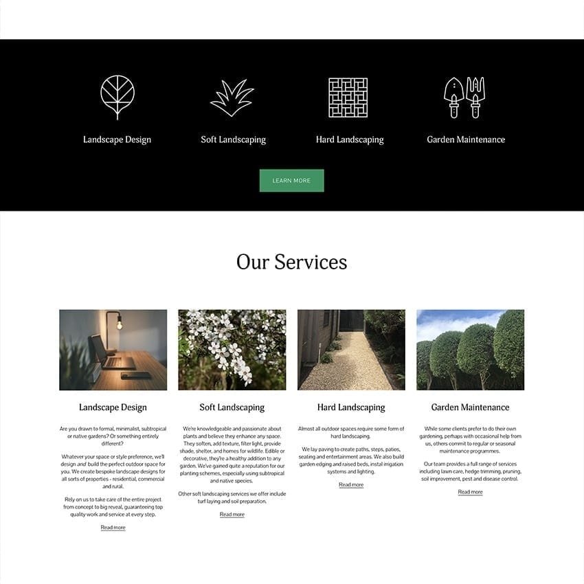
Symmetry Landscaping
WEBSITE · LOGO · COPY · SOME PHOTOGRAPHY
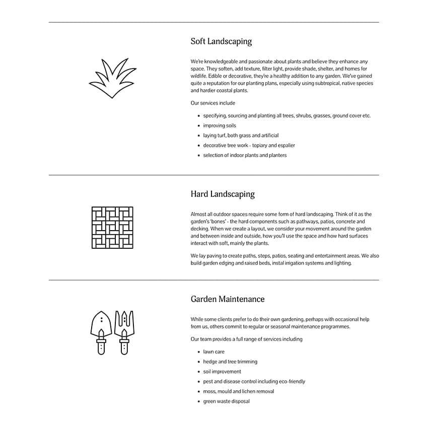
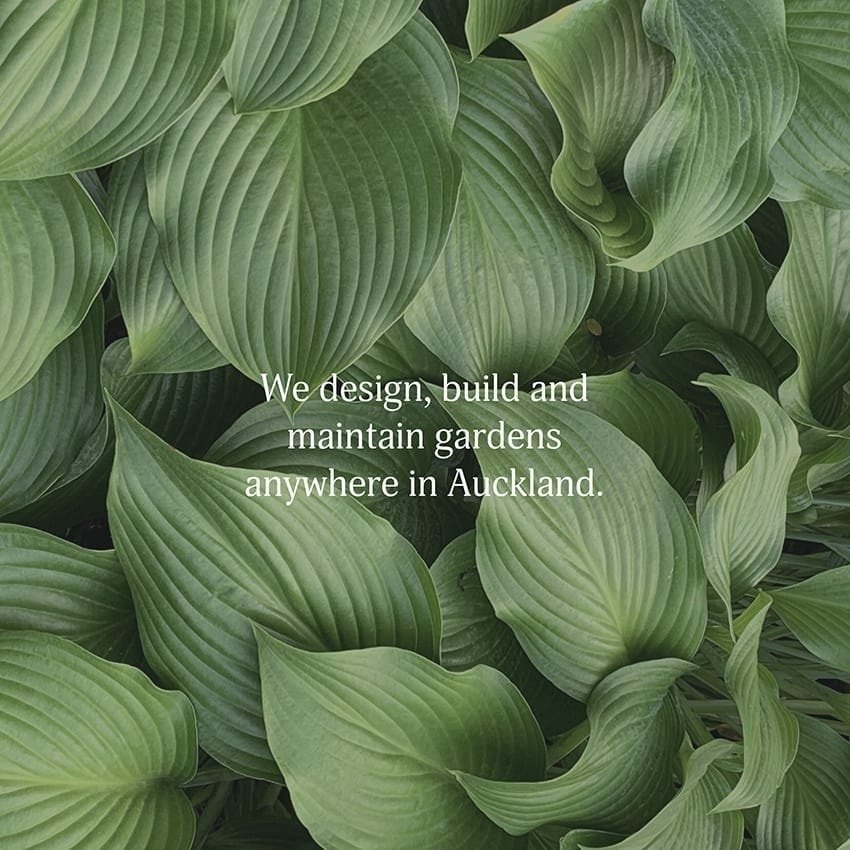
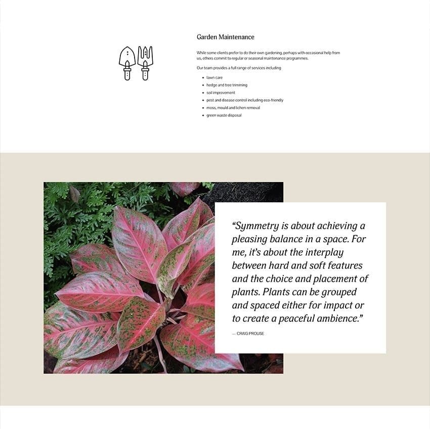
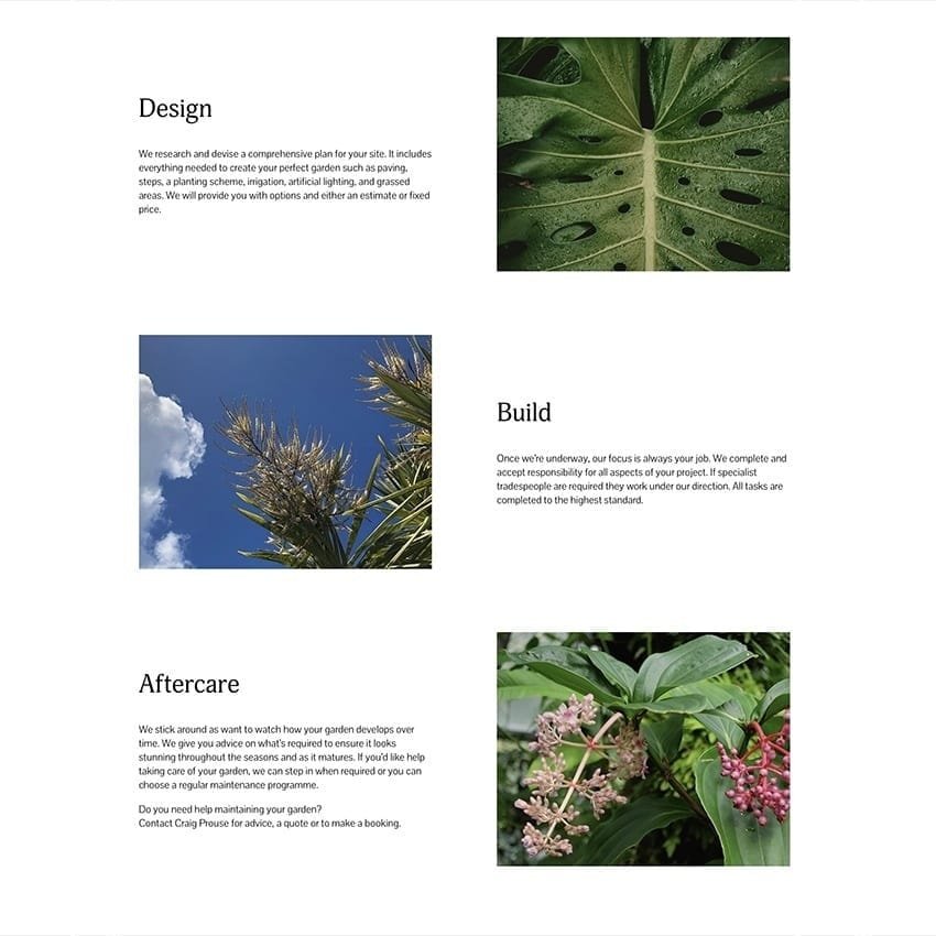
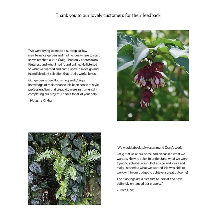
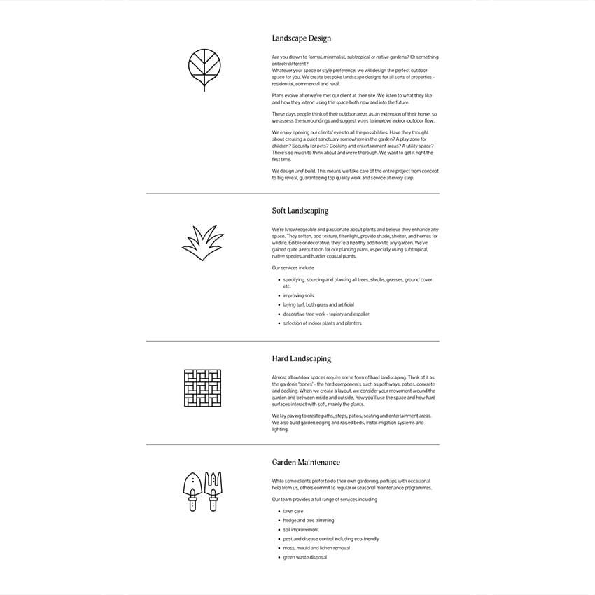
We helped launch Symmetry Landscaping’s new business in Auckland. Our client has a long track record in the industry having designed and maintained a huge variety of outdoor spaces while working for other landscape designers. Michelle worked closely with our client, Craig Prouse, in the creation of his logo which is in two versions - as green on a white background and reversed on black. It’s on his website, business cards, on his ute and social media pages. The copy arose after a long conversation with Craig. We had to be inventive when it came to the imagery. Craig supplied some shots, Michelle found others in image libraries and Diana contributed native flora and foliage from her archive.
Our client will manage aspects of his website from here on, therefore, some elements such as the copy and photography, may change as the company develops.


Australian Natural Nanny Network
LOGO · ILLUSTRATION · CARDS
'Working with Diana and Michelle has been a deeply rewarding, creative and fun journey! Having never done such a thing before, I couldn't have chosen two better people to build my first website.
They have been incredibly thorough, clear and direct in their communication, ideas and feedback (and lovingly so)!
I felt there was a perfect balance of professionalism and compassion, as well as excitement for my project. This was much appreciated and enabled me to enjoy the process.
It is clear that both Diana and Michelle love what they do as their committment to my project was unwavering.'
Melissa Hughes of Australian Natural Nanny Network talks about her experience working with Webdesign and Copy on her original website and logo.


New Zealand Terms and Conditions
BRANDING · BUSINESS STATIONERY
Michelle created superb branding for me. Stylish, clear and inviting. Loved my logo and great results. Very pleased.'
John Hogan, Lawyer

